Line: Line can be used to create an illusion, add depth to an image or create shadows.
 http://www.studentartguide.com/articles/line-drawings
In this pictures line had been used to add depth and to make the picture seem 3-D
 http://mrsbigeloweastleecampus.weebly.com/line-in-famous-art.html
In this picture the lines are being used to portray an illusion, it looks as though the waves are real when it’s just lines.
 http://curkovicartunits.pbworks.com/w/page/11306896/%22Make%20You%20Mark%22%20-%20Line%20Drawings
This pictures shows different uses of line, some of them are being made to create a shadow, a criss cross pattern.
Point: Point can be used to emphasis something in art or to set a focal point.
 http://artdocents.files.wordpress.com/2013/04/oped2.jpg
The fact that the shapes all join in the middle of the paper creates a sense of depth and makes a focal point in the center of the page.
 http://quilterbeth.blogspot.co.uk/2010/04/bethlyric-project-week-11-focal-point.html
The white circle is the focal point here.
Shape: Shapes are used to show the viewer what the artist is trying to portray. It can be plain and simple or it can be abstract and open for interpretation .
 http://non-art-teacher-designs.blogspot.co.uk/2012/01/implied-free-form-shapes.html
The use of the triangles and the areas cut out make scissors appear when there wasn’t any.
 http://non-art-teacher-designs.blogspot.co.uk/2012/01/implied-free-form-shapes.html
Same with this picture however this time the picture is of a frog.
Form: Form creates the illusion of volume.
 http://www.interactiveartschool.com/lesson18CameraDistortion.HTML
The use of form makes these images look 3-D using shadows.
 http://gettingtoknow.com/shape-and-form-in-art-stills/
This shows it very well.
Scale: Scale refers to the different sizes of objects in a picture.
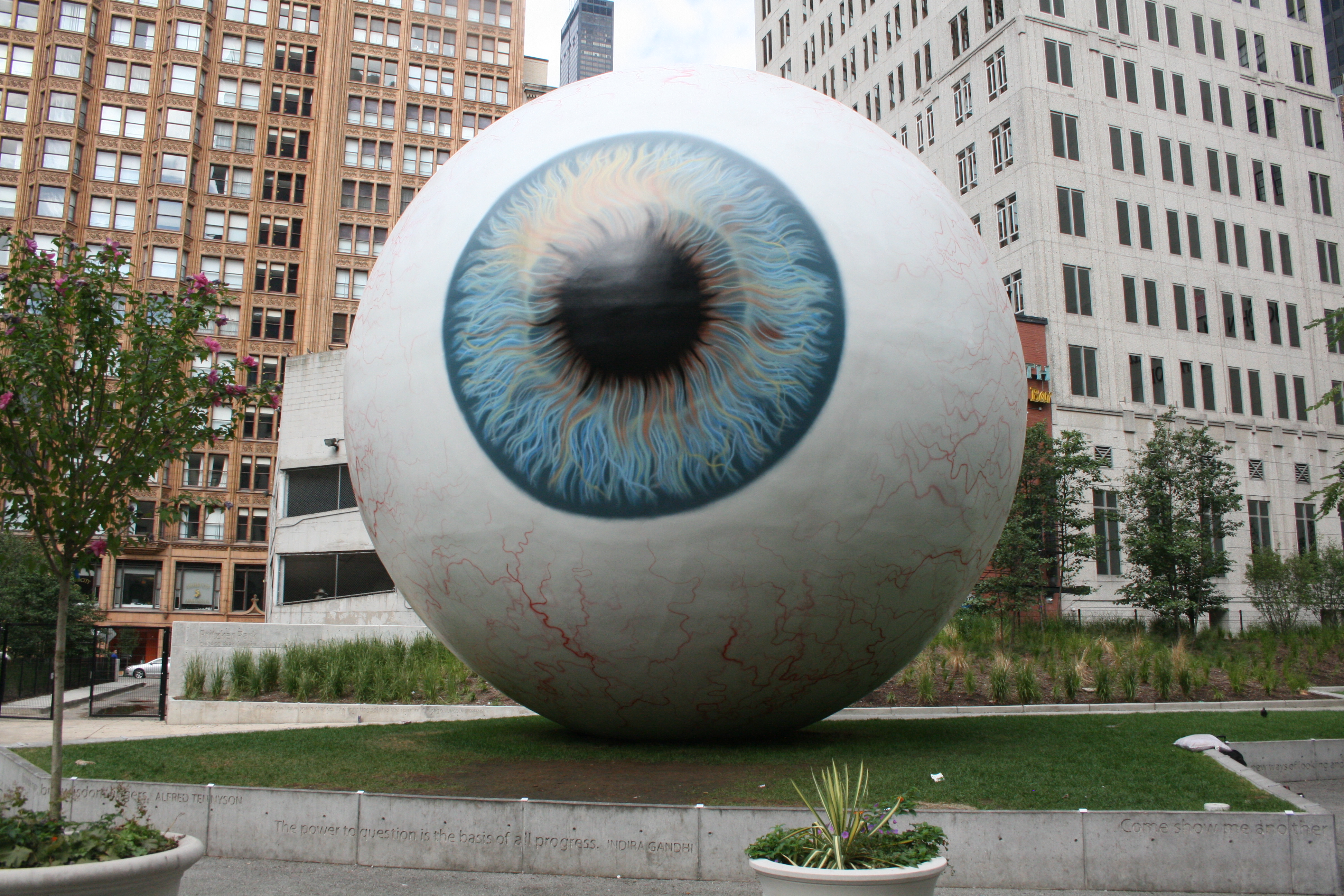 http://urbanmilwaukee.com/2010/08/19/chicago-and-milwaukee-large-public-art-and-placemaking/
A usually small object enlarged to emphasize
. http://www.sophia.org/tutorials/design-in-art-scale-and-proportion
Scale and proportions.
Pattern: Patters can be used for decoration, filling in an object etc.
 http://en.wikipedia.org/wiki/Pattern
This pattern here has been used for decoration.
 http://www.pinterest.com/izeondesign/patterned-object-ideas/
This bear has used patterns to fill it in with colour and make it look interesting.
Composition: Composition is what makes a picture look the way it does. It is usually divided into three quarters so not one area is too cluttered.
 http://muddycolors.blogspot.co.uk/2013/12/a-baroque-composition.html
You can see here that the lines of composition make a triangle etc. It makes the painting look right and not too cluttered.
Contrast: Contrast is used to emphasis or compliment certain colours in a painting. It can be used to make things stuck out also.
 http://debbiehodge.com/2011/04/use-color-contrast-to-make-art-journaling-pages-pop/
If you pick a colour, say green, then its contrasting colour is red as it is opposite green. It just helps to make objects stick out etc.
Texture: Texture can be used to enhance an artists interpretation of their own work or to support their ideas.
 http://www.digitalartistdaily.com/blog/2011/11/top-10-texture-techniques-for-digital-artists/
